Window Graphics – Inside or Outside
September 24, 2014
Getting Greener with the Latest HP Latex Technology
May 18, 2021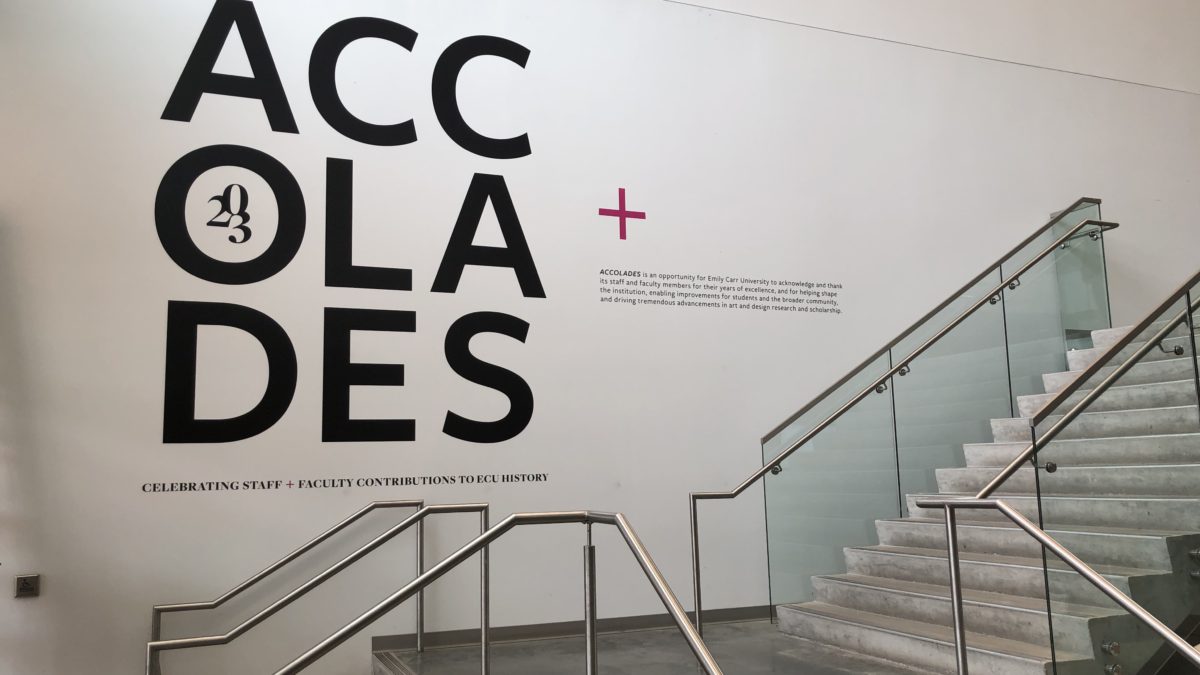
Cut vinyl lettering refers to letters that are individually cut from sheets of solid-coloured adhesive vinyl using a computer-controlled cutting machine (often called a vinyl cutter or plotter). Unlike printed graphics, which apply ink to the surface of a material, cut vinyl involves physically cutting out the desired shapes. The process can apply to just about any shape with certain limitations on complexity and use of multiple colours.
After your pattern is cut on the plotter, the excess vinyl that is not part of the design gets removed or weeded away. Often a transfer tape or mask is applied over top of the cut out elements to maintain their relationship to one another. The mask removes the cut vinyl from the peel and stick backing paper and then transfers and sticks your graphic to the final surface. The adhesive vinyl has a bonding strength that is stronger than the adhesive mask so the mask can be removed as a final step leaving just the cut elements behind.

Common Applications of Cut Vinyl Lettering
- Vehicle Graphics
- Company logos, contact info, and promotional text on cars, trucks, vans, or boats.
- Company logos, contact info, and promotional text on cars, trucks, vans, or boats.
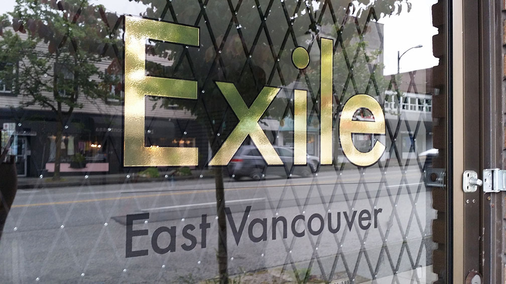
- Window and Glass Signage
- Storefront hours, branding, or sales messages on windows.
- Storefront hours, branding, or sales messages on windows.
- Wall and Interior Décor
- Motivational quotes, branding, or directional signage inside offices or homes.
- Motivational quotes, branding, or directional signage inside offices or homes.
- Signage and Banners
- Long-lasting signs for businesses, real estate, or events.
- Long-lasting signs for businesses, real estate, or events.
- Mailboxes and Address Numbers
- Durable and weather-resistant identification for homes and buildings.
- Durable and weather-resistant identification for homes and buildings.
- Event and Exhibit Graphics
- Clean, professional text and logos for trade show booths or temporary displays.
- Clean, professional text and logos for trade show booths or temporary displays.

Benefits of Cut Vinyl Lettering vs. Printed Alternatives
| Feature | Cut Vinyl Lettering | Printed Vinyl Graphics |
| Durability | Highly durable; resists fading, peeling, and weathering for years. | Generally less durable; may fade or scratch over time. |
| Clean Appearance | Crisp, sharp edges without pixelation or ink bleed. | May suffer from print resolution limits or color bleed. |
| Cost-Effective for Simple Designs | Cheaper for solid-color text and logos. | More cost-efficient for complex, full-color images. |
| No Ink Involved | Solid color comes from the vinyl itself—no fading from ink degradation. | Ink can fade over time, especially with UV exposure. |
| Customization | Easy to swap out letters or update parts of a design. | More effort to change parts of a printed graphic. |
| Professional Finish | Looks painted-on when applied correctly—no background. | Often has a visible printed background or border. |
Cut Vinyl Design Considerations
Small Vinyl Lettering? How small is possible?
We often make small vinyl lettering for business hours and gallery walls. A common question is, how small is possible? As there are many different fonts, with different weights and complexities there is no one-size-fits-all. A general rule for minimum size is 1cm (3/8″) letter height. Making sure that all lines are at least 2mm thick is also a good way to check if the letters will cut well (have a look at our resources page for additional information on design preparations).
Smaller letters are sometimes possible. But there are several reasons to consider making your lettering larger:
- Durability – tiny letters dont have much adhesive on them to keep them stuck to a window or wall
- Precision – at very small sizes, lettering can become distorted and change the look of the text
- Cost – tiny letters are time consuming to produce so we often need to add a shop-time charge to produce them
Outlining Fonts for Vinyl Lettering
Fonts are unique to each computer with some coming standard on a device and others being added by the user. If we do not have your font installed in our system when opening your file, another font is substituted for the original. This will change the look and feel of the design. This can even happen with common fonts as slight changes to the font name can create problems. The solution to this is to ‘outline’ your fonts. Outlining the font turns the editable font into “curves” or shapes preventing text changes or font changes once you send the file. It is a good idea to also save a non-outlined version to your computer so that you can make text changes later if necessary.
Check out this simple tutorial on outlining fonts in Adobe Illustrator.
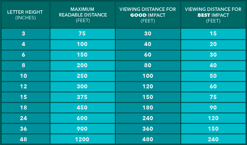
Choosing the Right Font Size for Visibility
How to select the right font size for maximum visibility and impact? Will the viewers be walking by? Driving down a busy street? It is important to consider the distance that you want to reach. One simple rule is 1″ of letterheight for every 10′ of viewing distance. Want people to read it from across the street? 30 feet (9 meters) of distance would be 3″ (7.5cm) letterheight for good legibility. 60 feet (18 meters) would be 6″ (15cm) letterheight. See chart below.
This simple rule gets you in the ballpark. You can also double it for maximum impact, while at at half of this size it will be barely readable. It is usually best to determine the required letterheight before choosing a sign size. However it is also important to consider the constraints of the area where you will be applying the lettering. For example, if you have a window that is 24″ wide this is an important factor in your text layout. Many people come to us with an idea of having a 6″ letterheight without realizing that this will make the overall words much longer or shorter than they expect.
Cut vinyl lettering remains a quality option for your graphic projects. It provides great durability with vibrant and long lasting colour. Its flexibility and relative ease of production adds to its versatility as a long standing solution for a variety of signage, communication, labeling and other design applications.
Have a question about what is possible? Get in Touch.